
Medina Studio: L'Atelier, défait.

The brief
Medina Studio is a Tunis-based womenswear house with three decades of heritage couture behind it: occasion gowns, mother-of-the-bride dressing, hand embroidery on tulle. The new creative direction strips that lineage to its load-bearing wall, the hand and the cloth, and rebuilds it as a contemporary minimalist ready-to-wear label. The brief was a Fall capsule launch that does not look like a Fall capsule launch. Eight pieces. One muse. One atelier morning. No spectacle.
The strategy
The fashion category shouts. Catwalk theatre, golden-hour rooftops, a cast of thirty in a cyclorama. Medina Studio had to do the opposite to read as a credible reposition.
The hand and the cloth
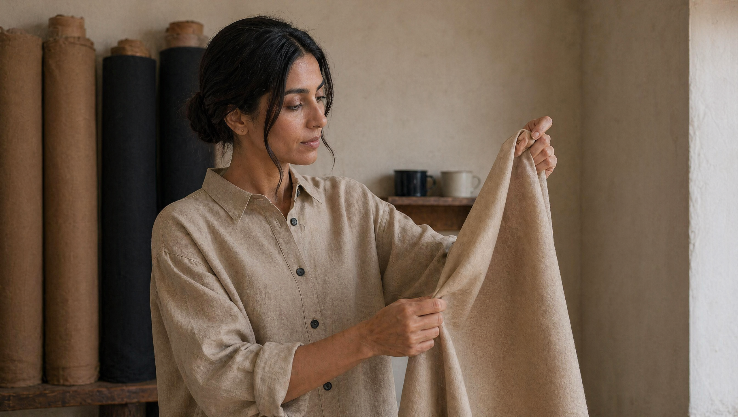
are the brand. Every frame foregrounds either fabric movement, a stitching gesture, a hem detail, or a cutting moment. Garments are presented in motion or in process, never as styled product.
One muse
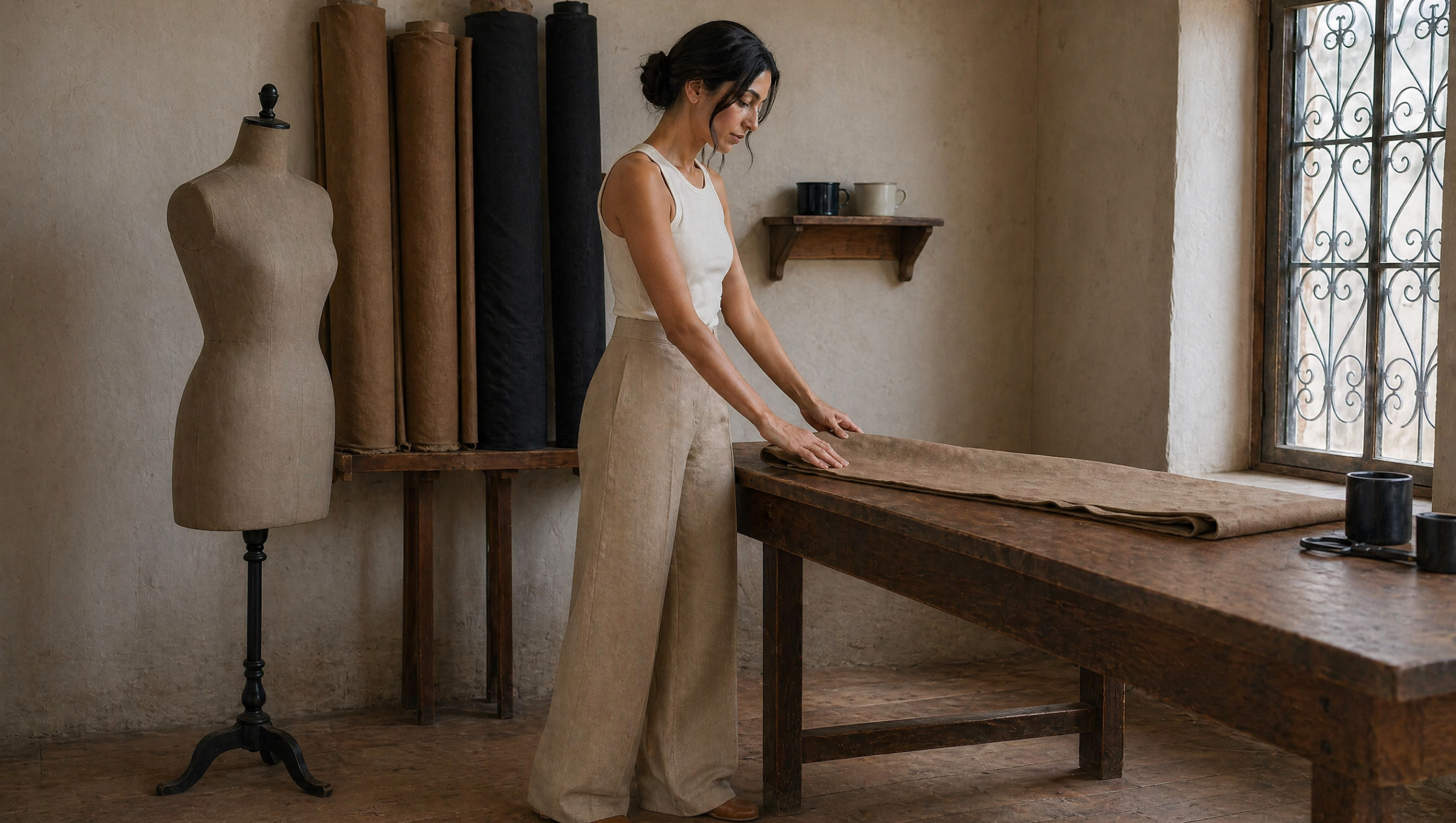
A single Tunisian woman, mid-thirties, anchors every people-frame. She is the brand’s first wearer. No cast rotation, no editorial diversity-of-bodies signaling. One face, one body, one register.
Atelier, not runway
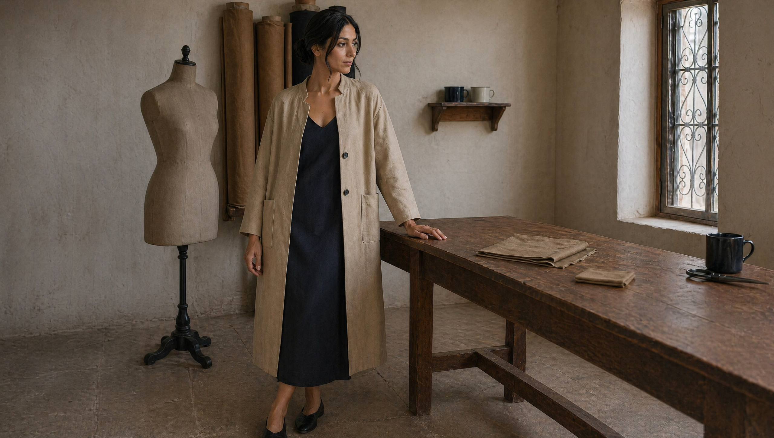
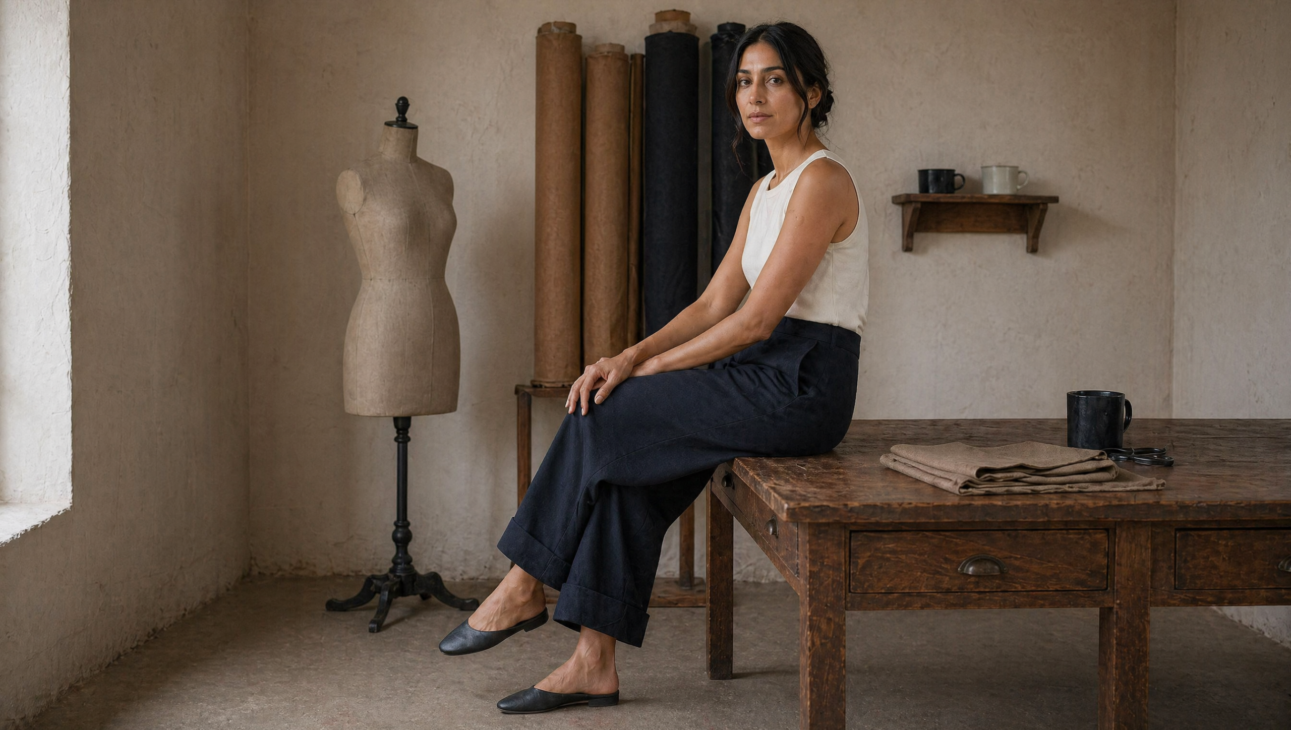
The setting is a working medina atelier, north-facing daylight, lime-wash plaster wall, wooden cutting table, bolt rack, a tailor’s mannequin. No backstage, no white cyclorama, no Tunisia-postcard architecture, no Sidi Bou blue.
No ornament, anywhere.
No embroidery, no sequin, no tassel, no ornate trim. The reposition’s whole point is that the brand’s value sits in cut and cloth, not in surface decoration. The single jewelry note is a thin gold ring and small studs.
The brand system
A single-script Latin identity. The wordmark is MEDINA STUDIO set in a refined humanist sans, thin weight, all caps, generous tracking. No serif. Serif would re-cue couture, which is exactly the wrong signal. The monogram is M·S with a small interpunct, used only as the social avatar and the lookbook colophon mark. The garment label, woven inside the back-neck tape, carries the wordmark on a single line and is out of camera in every frame because the rule is no logo on garments.
The palette is four colors with no accent. A subtraction. Adding a fifth color would betray the brief. Plâtre cream for the lime-wash wall and the lookbook page, ink for the wordmark and the printed type, Lin brut warm tan for the linen-wool cloth, Bleu nuit profond deep blue-black for the cool-tone capsule pieces. The capsule lives entirely on those two cloth tones with subtle internal variation and a published palette that stays at four.
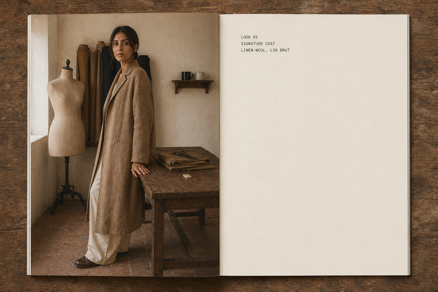
The type system pairs the refined humanist sans for display with a quieter humanist sans for body and a small monospaced face for archival captions on the lookbook. The monospaced face is the single typographic register that signals workshop, not fashion magazine. There is no italic, no bold, no drop cap. The reposition is in the restraint.
The capsule
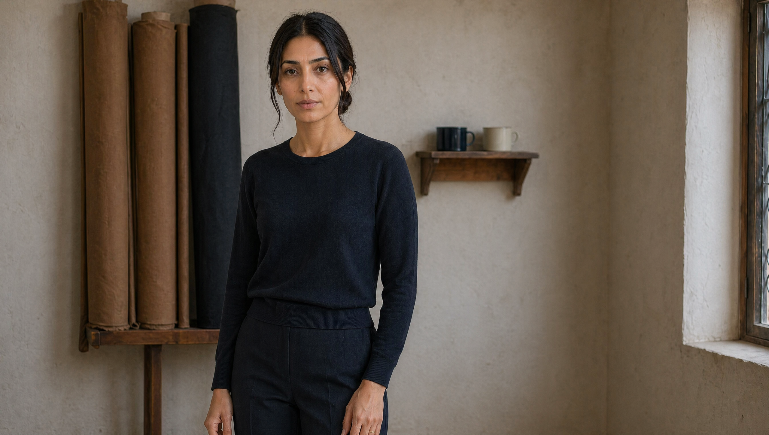
Eight pieces. Two coats, two trousers, two shirt-blouses, one slip dress, one fine-gauge knit. Every piece in either Lin brut warm tan or Bleu nuit profond deep blue-black. Same cloth language across the capsule, same stitch density, same button material, same hem treatment. The capsule is a single design conversation in eight sentences.
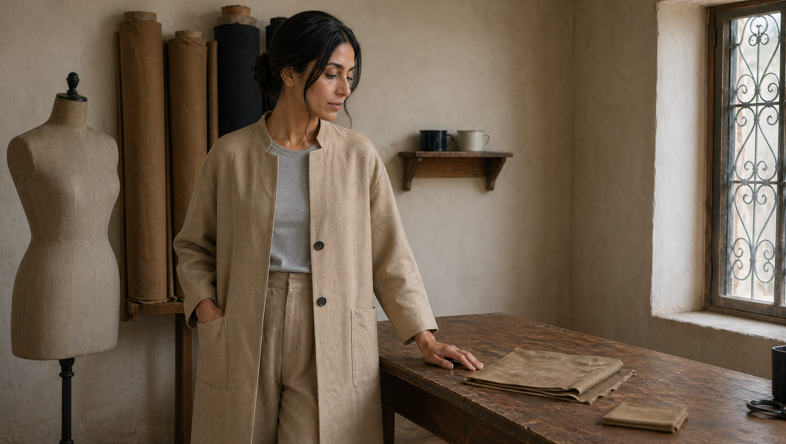
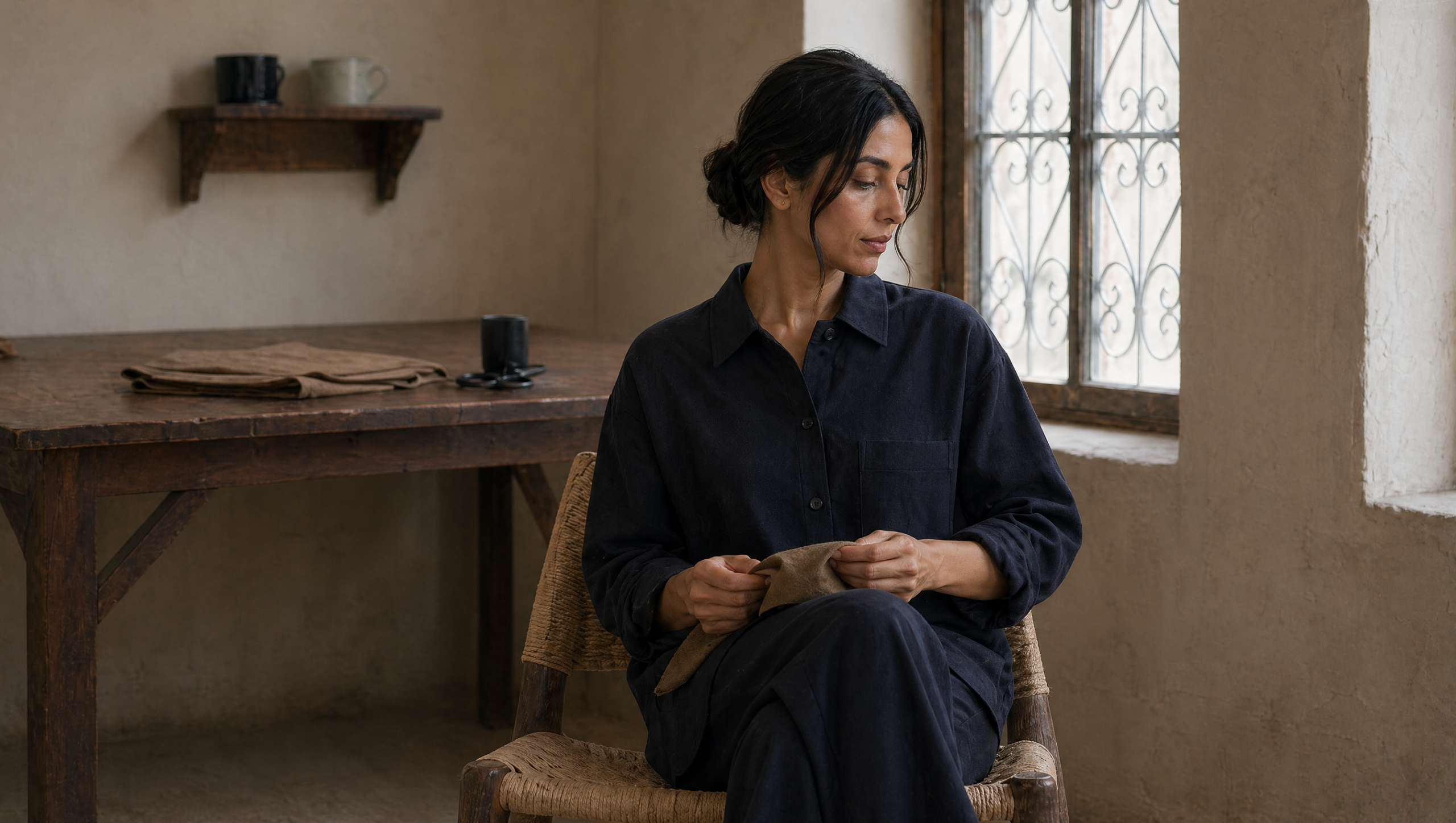
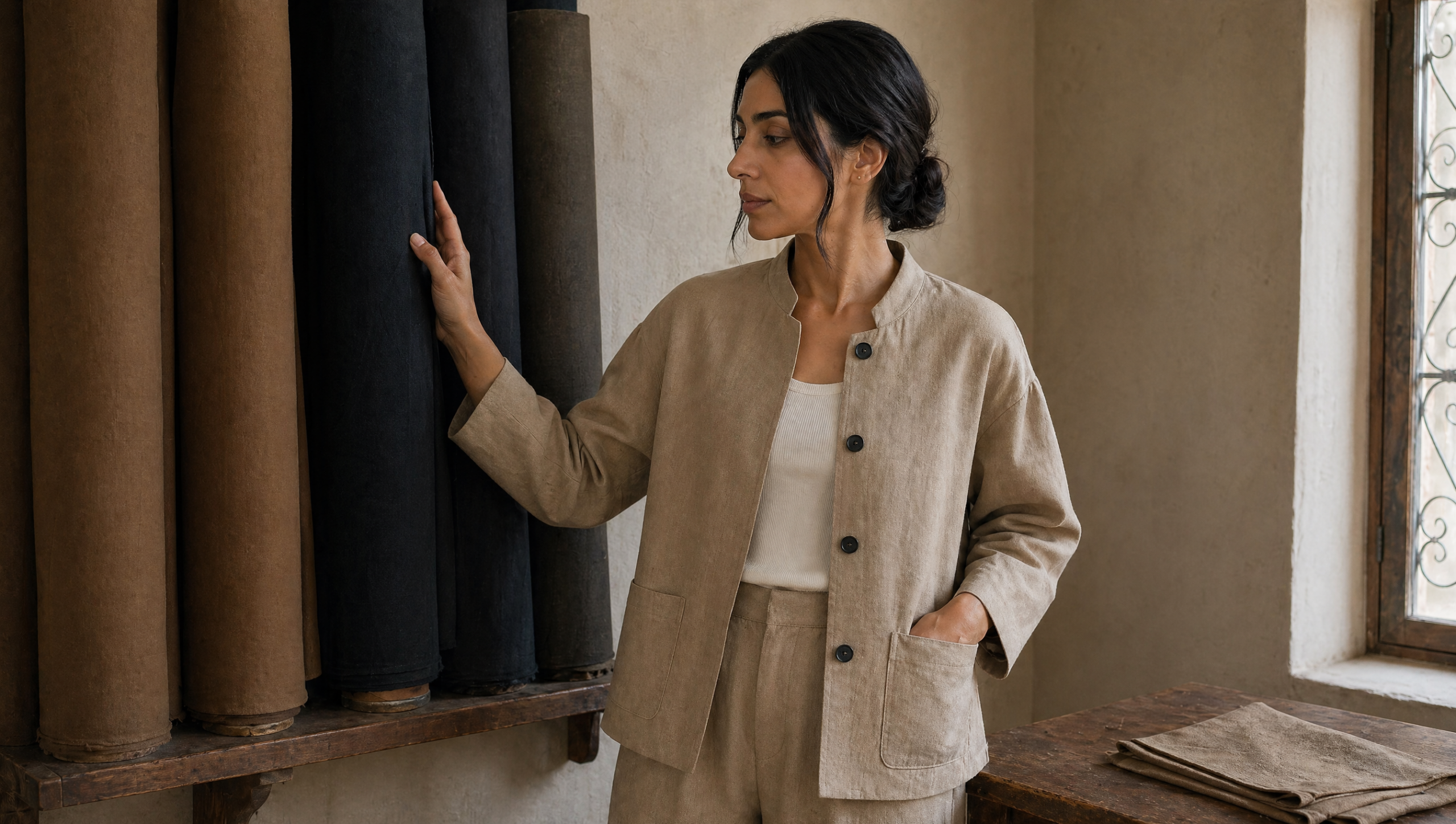
The atelier and the hand
Two detail beats sit alongside the looks: a hand on oxidized brass shears mid-cut on a chalk line, and a hand-stitch macro on a deep blue-black hem. Both shot at the muse’s hand, same gold ring, same skin tone, same daylight as the look pages. The detail beats carry the brand’s claim that the hand is the brand. Without them, the lookbook reads as styled product. With them, it reads as a workshop.


Watch the film
The voice-over breaks the tagline reflex. Twelve spoken words across thirteen seconds. Lines are nouns. Silences are structural. The brand name lands as a colophon, not a punchline:
Le tissu.
La main.
Ce qu’on garde. Ce qu’on coupe.
Medina Studio.
The tempo is slow. Ninety-five to a hundred and five words per minute. Air between every line. The voice trusts the cloth to do half the talking. The Arabic alternate cut substitutes the two middle beats with Tunisian dialect, the same structure, the same restraint.
The lookbook and the press kit
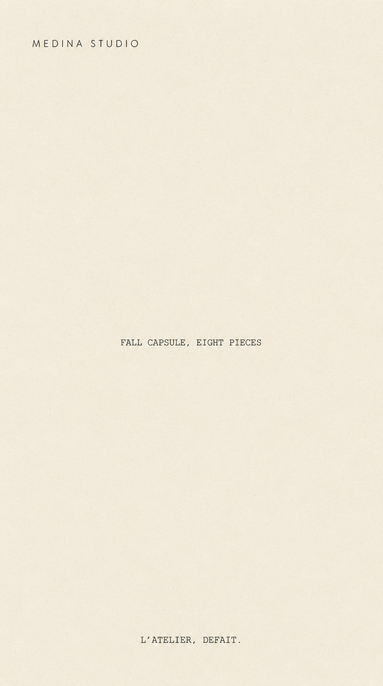
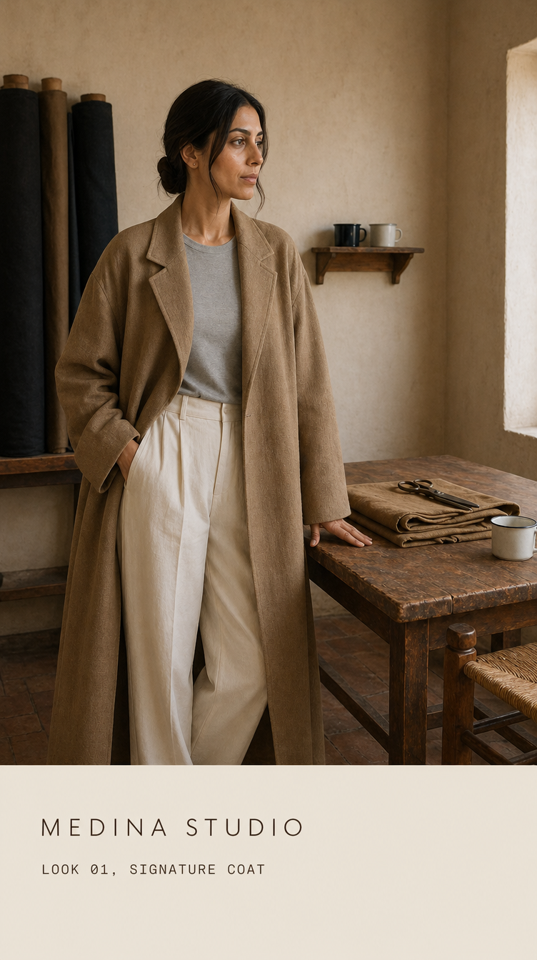
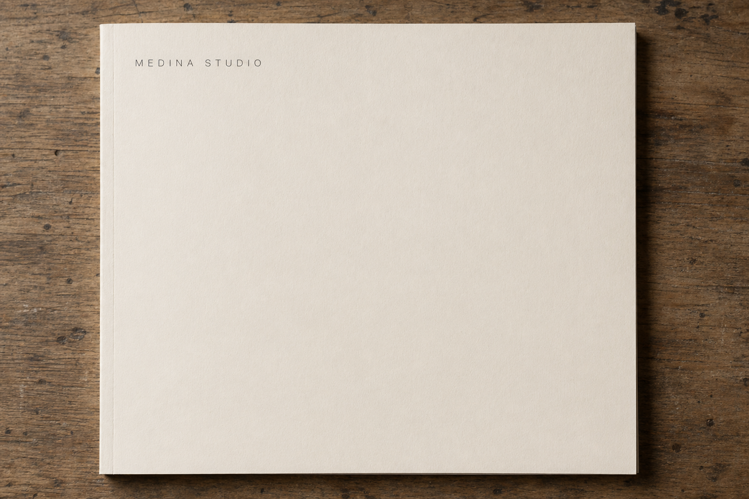
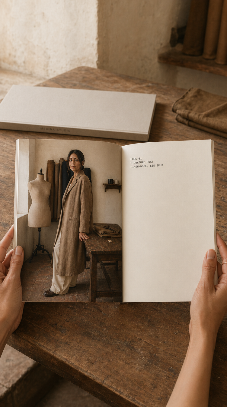
The deliverables go past the film. A printed lookbook in warm cream cardstock, full-bleed image left, monospace caption right, eight spreads, one per look. A press release sheet with the wordmark on the header and the brand text below. A monogram business card in cream cardstock. A six-frame Instagram story sequence: cover, three look frames, the manifesto beat in pure typography on cream, and a press-mention placeholder for the inevitable editorial pickup.
How it was made
The project was produced with AI image and video generation, then composed by hand. The order matters.
A full brand system was locked before any render. Wordmark, monogram, four-color palette, two-typeface system, four-rule art direction guide. Then a reference library was built specifically for Tunisia. Not the Maghreb, not MENA, not the Mediterranean. Tunis. A working medina atelier interior with lime-wash plaster wall and a single tall narrow window casting north-facing daylight. Linen-wool blend cloth in a warm tan that is not Moroccan, not Andalusian, not Marrakech-riad. Without anchoring on real Tunisian and contemporary minimalist references at once, base models default to Marrakech amber or to fashion-influencer rooftop, which is exactly wrong.


The muse was locked first. A single character sheet, three angles, full editorial prep on the day: hair styled in a clean low chignon at the nape with deliberate face-framing strands, beauty in the no-makeup makeup register of a contemporary house, the kind of work an editorial makeup artist does in twenty-five minutes that reads as if the woman simply has good skin and good light. She walks into every frame already prepared for camera. That single locked identity is the load-bearing anchor in the campaign. Every people-frame in the lookbook and every cut in the film references her at maximum identity weight.
The capsule garments were generated next. The signature coat was prompted in full descriptive detail, then iterated until the cut, the drape, the stitch density, and the button placement read clean. That render was locked as canonical. The remaining seven pieces inherited fabric, drape, stitch register, and atelier light from the locked coat via image-to-image reference, with only the garment piece changed per render. The capsule reads consistent because consistency was structural, not editorial.

The film is a single thirteen-second cut composed freestyle from the eight look stills run through a multi-shot storyboard generation, plus an end-card plate. The published edit was not pre-storyboarded. It was assembled by hand from the available cuts, choosing tempo and order to give the film a tonal arc rather than a spreadsheet of looks. The wordmark on the end-card was composited in After Effects, never rendered by the video model.
The wordmark, the monogram, and the lookbook spreads were designed in our studio. The Instagram stories and the printed press kit were built around the locked typography. The mockups that show the lookbook held in hands, the story on a phone screen, and the press kit on a desk are the deliverable that lets a press buyer or a wholesale lead read the whole brand at a glance.
Post-production was not optional. A neutral grade pass matched every still and every video cut to a single LUT. Retouch was restrained to micro-detail: a stray hair, a soft micro-correction on the gold ring placement where the model drifted, a stitch line straightened by hand where the generation left it wobbly. The voice-over was recorded against a quiet atelier ambient bed, mixed below the voice, no music.
What it was built to do
Medina Studio was built to read as a credible reposition. Not as a sell-through capsule. The capsule is small and the volume is symbolic. Success is the editorial pickup, the wholesale meetings the film opens, the qualitative shift in how the brand reads on a contact sheet. Whether it would have hit those targets is the job of a real press cycle the fictional brand does not have. The campaign is the proof of what the production can carry.
Disclosure
Self-initiated concept project. Medina Studio is a fictional brand created to demonstrate AI-assisted campaign production for the contemporary minimalist fashion category. No real fashion house, person, designer, or garment is represented. The muse is a generated character, not a real person.