Ayla: Ramadan Campaign
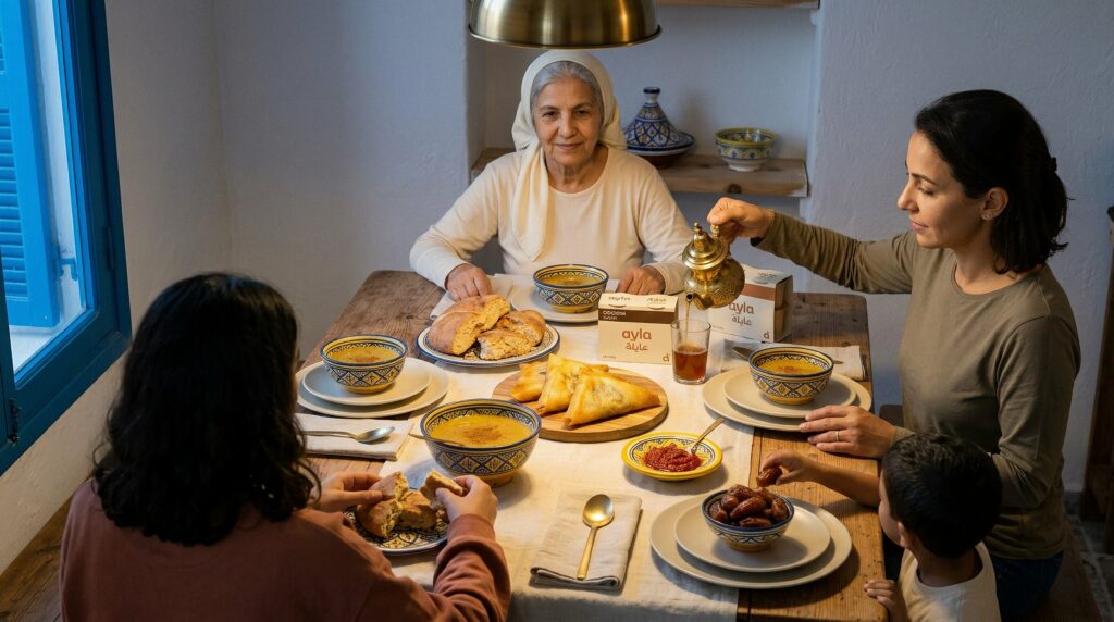
A Ramadan campaign for a chilled dessert multipack, aimed at the mother choosing what closes ftour. The category shouts. This one sets a table instead.
The brief
Ayla is a premium dairy-dessert line, three flavors in a 4x100g multipack, sold chilled in Tunisian supermarkets. The brief was a Ramadan campaign that drives in-store trial during the cycle and sets up the brand to live on the shelf year-round. The audience is a Tunisian mother doing her grocery run the week before Ramadan at Carrefour, Monoprix, or Géant, choosing the dessert that will close ftour for a multi-generational family table.
The strategy
The FMCG dessert category shouts. Glossy indulgence, syrup pours, studio gloss, smiling families. Ayla had to do the opposite to earn a premium cue.
Four rules were locked before production:
The table is the brand
Every lifestyle frame centers a real Tunisian ftour table, not a pack beauty shot. The pack arrives last.
Hand, steam, texture
Every frame carries one real human gesture, one real breath of air, one real surface. Defeats the too-clean AI tell.
Tunisian
not pan-Arab. Specific ftour cues, brik, chorba frik, harissa, deglet nour, tabouna bread, and Tunisian faces. No Gulf dress, no Moroccan tiles, no MENA-generic casting.
Bilingual per asset not everywhere
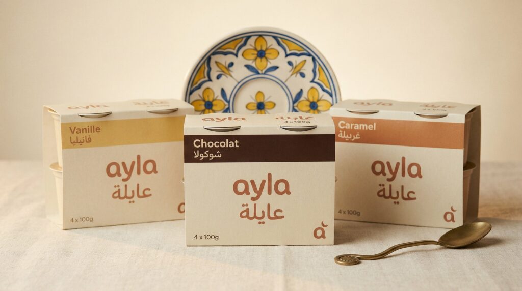
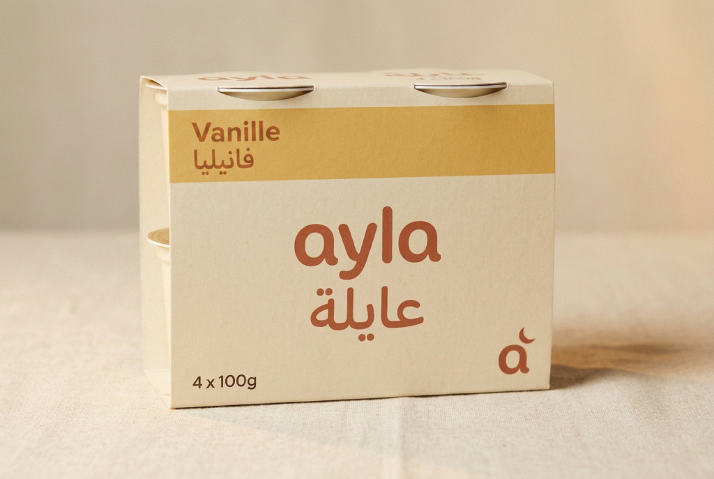
Pack carries French primary with Arabic secondary. The Ramadan key visual inverts, Arabic primary with French secondary. Each asset picks a lead language.
The brand system
A warm rounded wordmark in lowercase, ayla in Latin with u0639u0627u064au0644u0629 in matched modernized Naskh. The Arabic reads phonetically close to the Latin, and the word itself evokes family in Maghreb usage. The pack palette is five colors: a cream base that ties the three SKUs together on the shelf, a terracotta brand signature, and three hero bands for flavor differentiation, deep chocolate, warm gold, copper caramel.
A warm rounded sans for wordmark and pull quotes, a humanist sans for body, a modernized Naskh for Arabic. Latin and Arabic never fight for the same baseline. They sit in deliberate lockups, separated by rule and white space.
The campaign
Three SKUs, a short second social film, a bumper for retail and programmatic, social media posts, and point-of-sale artwork.
The 10-second film arcs from a wide table the family is sitting around, to a hand closing on a brass spoon, to a macro of the spoon lifting vanilla from the cup, to the grandmother softening in a single frame, to a pack reveal on cream linen. The 6-second bumper strips people out entirely and lets the product speak. Two distinct films from the same production, because retail placements and story placements need different grammar.
The film threads the same day in cuts, ending on the bilingual wordmark against cream.
How it was made
The project was produced with AI image and video generation, then finished by hand. The order matters.
A full brand system was locked before any render, wordmark, palette, type system, four-rule art direction guide. Then a reference library was built specifically for Tunisia. Not the Maghreb, not MENA, not the Mediterranean. Tunisia. Sidi Bou blue on a window frame, Nabeul ceramic with its distinctive yellow-and-blue floral pattern, Tunisian brass tea service (not Moroccan filigree), domestic-style headscarf draped loose rather than wrapped tight, Tunisian ftour staging with brik, chorba frik, harissa, deglet nour, tabouna. Without anchoring on real Tunisian references, base models default to generic MENA or, more often, Moroccan, which is exactly wrong.
The pack photography was generated first and locked as canonical before any lifestyle shot. One SKU was iterated until the French and Arabic typography held clean, then the other two flavors and the 3-pack lineup inherited from that locked render. Every downstream shot that featured the pack was anchored to that product photography, not regenerated.
For the film, two paths were run in parallel. A per-cut pipeline for editorial control, and a multi-shot-per-generation storyboard path for global consistency. The storyboard path held character identity and grade across cuts better, so it shipped.
All Arabic type in the final assets was typeset in Illustrator and composited in post. AI does not render Arabic letterforms reliably; for a Tunisian audience, a broken letter is a dealbreaker.
Every final still passed through a manual post-production pass: color grade to a single LUT, skin retouch restrained to micro-detail, real-texture overlays on linen and brass, real-hand composites where the AI struggled. The film was cut and graded in the editing room the same way a shoot would be, the generated clips are the footage, not the final product.
What it was built to do
Ayla was built to earn shelf presence in 180 Tunisian supermarket locations during the first Ramadan cycle, with sell-through that extends the brand past the season into year-round use. The campaign was designed for the mother doing her grocery run, the grandmother at the table, the child reaching for a date. Whether it would have hit those numbers is the job of a real retail funnel the fictional brand does not have. The campaign is the proof of what the production can carry.
Watch the Full Video
The voice-over is written for the Tunisian Ramadan evening, in the register a real Tunisian mother would use, delivered warm and unhurried.
Il y a des soirs où tout s’arrête. La table se dresse, la famille se retrouve. Et pour finir, un goût qu’on partage. Ayla.
Four lines, no tagline after the brand name. The lines before Ayla are the tagline. A faint distant call to prayer sits in the ambient bed at the edge of hearing, not as a cue but as atmosphere, the signature Tunisian Ramadan evening sound.
Disclosure
Self-initiated concept project. Ayla is a fictional brand created to demonstrate AI-assisted campaign production for the premium FMCG category. No real hotel, person, product, or dairy brand is represented.