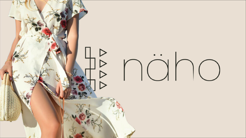
A logo and the full identity system around it: typography, color and spacing rules built so the brand stays itself wherever it lands.
Graphic Design
What näho actually is
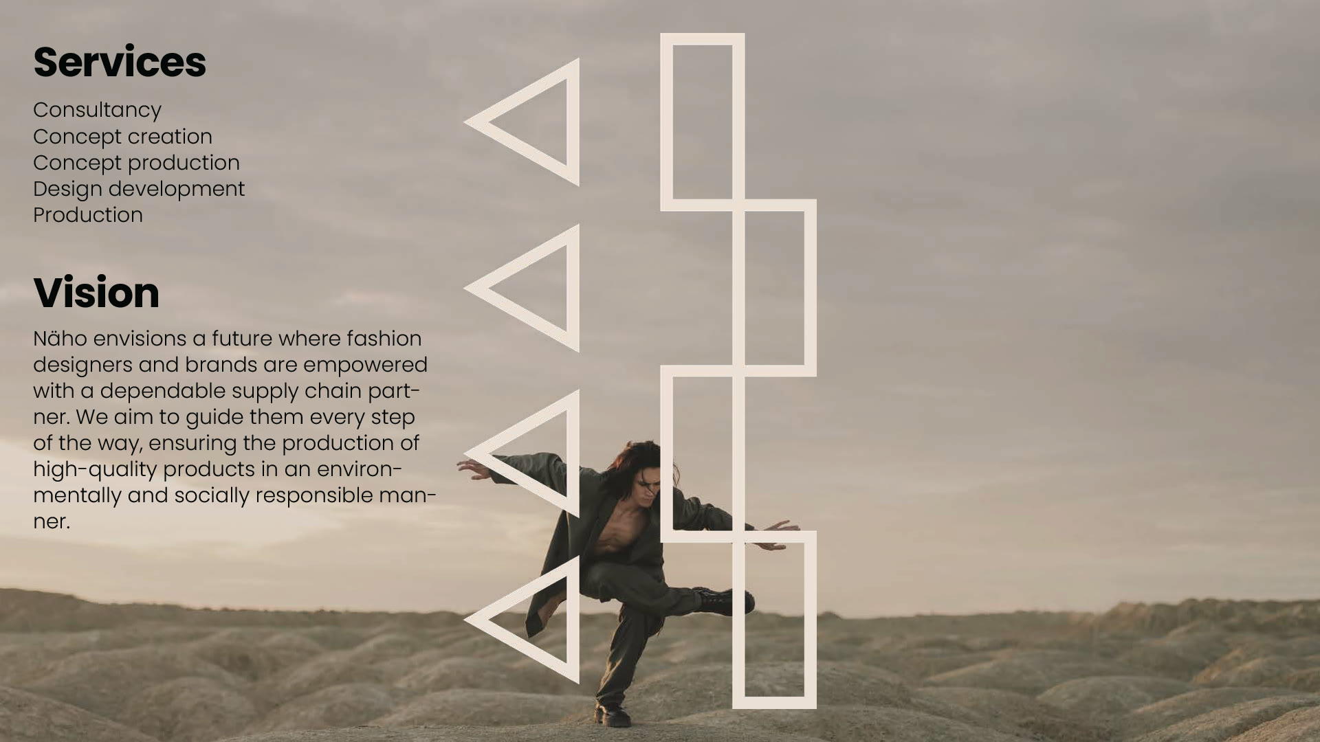
Not a clothing label. näho is a fashion consultancy that sits between designers and the factory floor: concept creation, design development, and production itself. What it sells is a dependable supply chain, and it says so plainly, that it wants to take on small projects with the potential to grow alongside it.
That matters for the identity, because the brand is not being bought by shoppers. It is being read by designers deciding whether to hand over their production.
A mark made of stitches
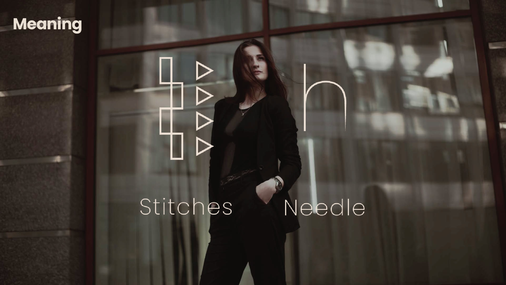
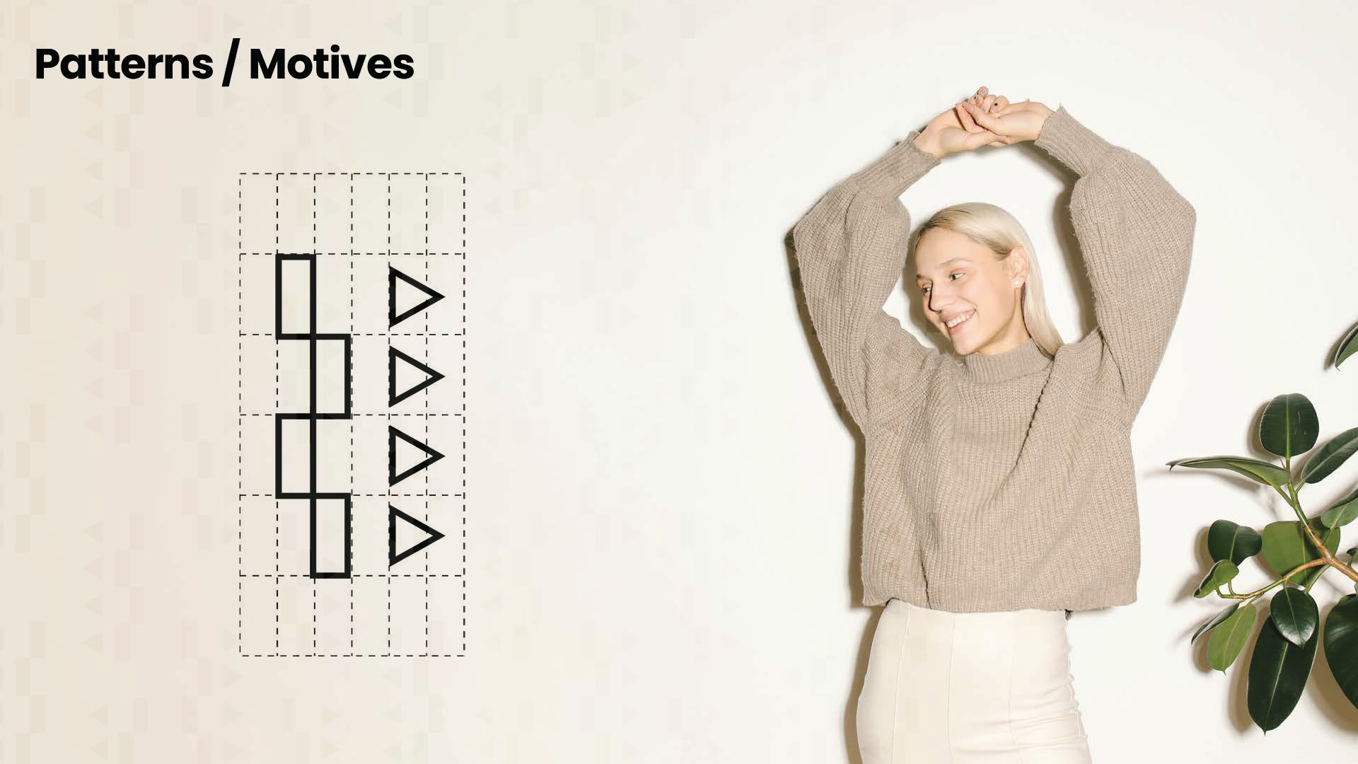
The symbol is built from the two things no garment exists without: a run of stitches and the point of a needle. A company whose product is production carries the smallest unit of production as its mark.
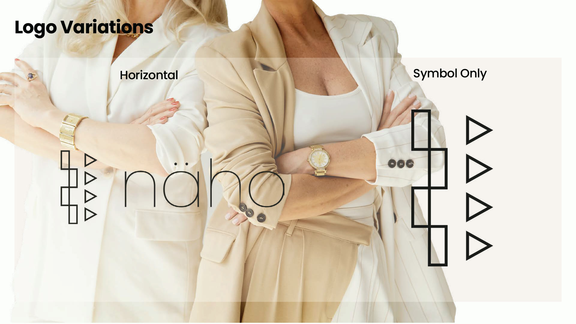
It is drawn geometrically so it survives being taken apart. There is a horizontal lockup with the wordmark, and a symbol that stands alone once the name is known, which is what a brand needs the day it stops being able to spell itself out.
The deliverable was never the logo
A consultancy selling reliability cannot have an identity that only works when the designer is in the room. It has to be applied correctly by a printer, a sign maker and whoever builds the next deck, none of whom will ask.
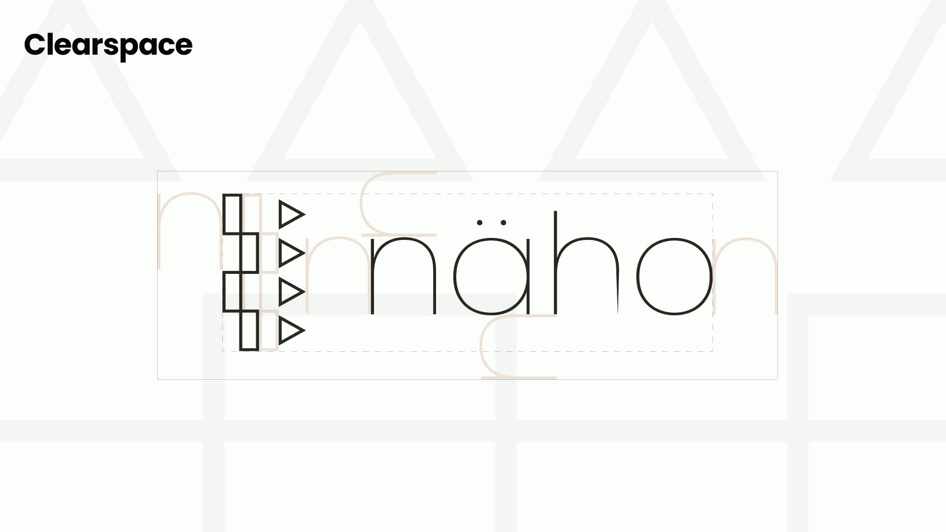
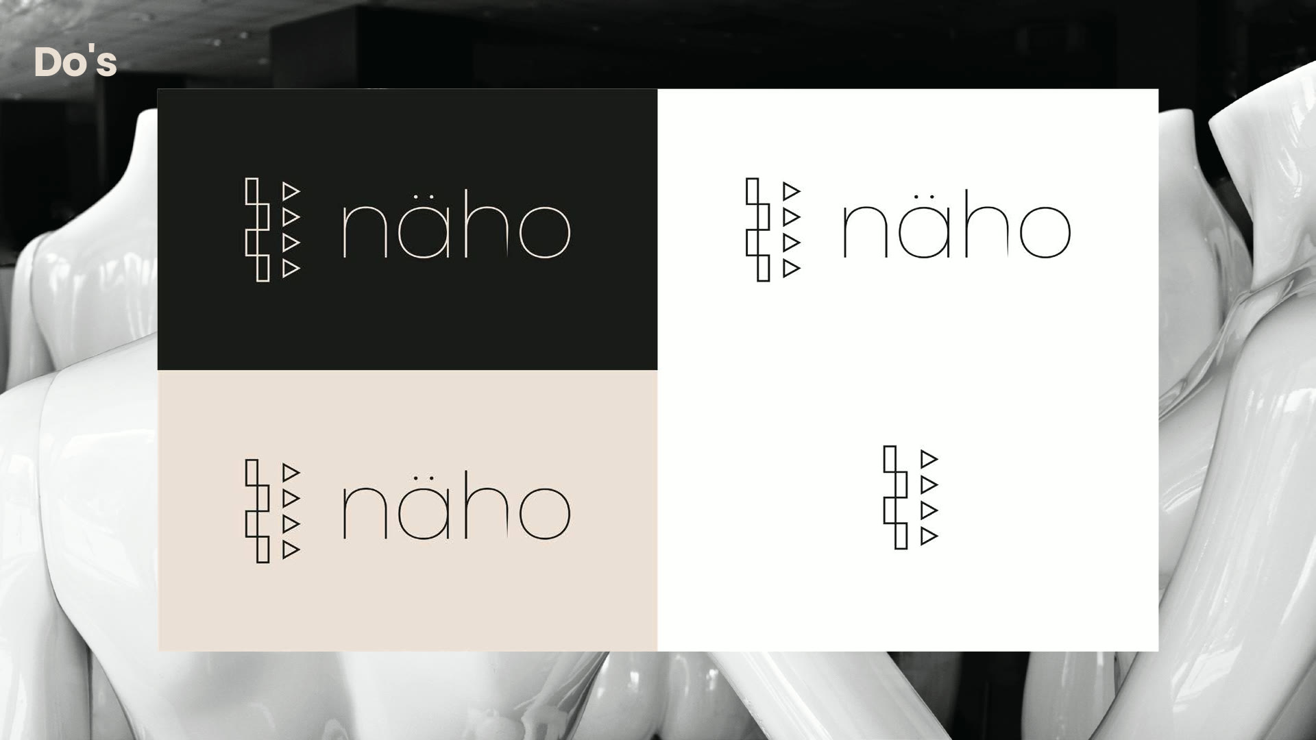
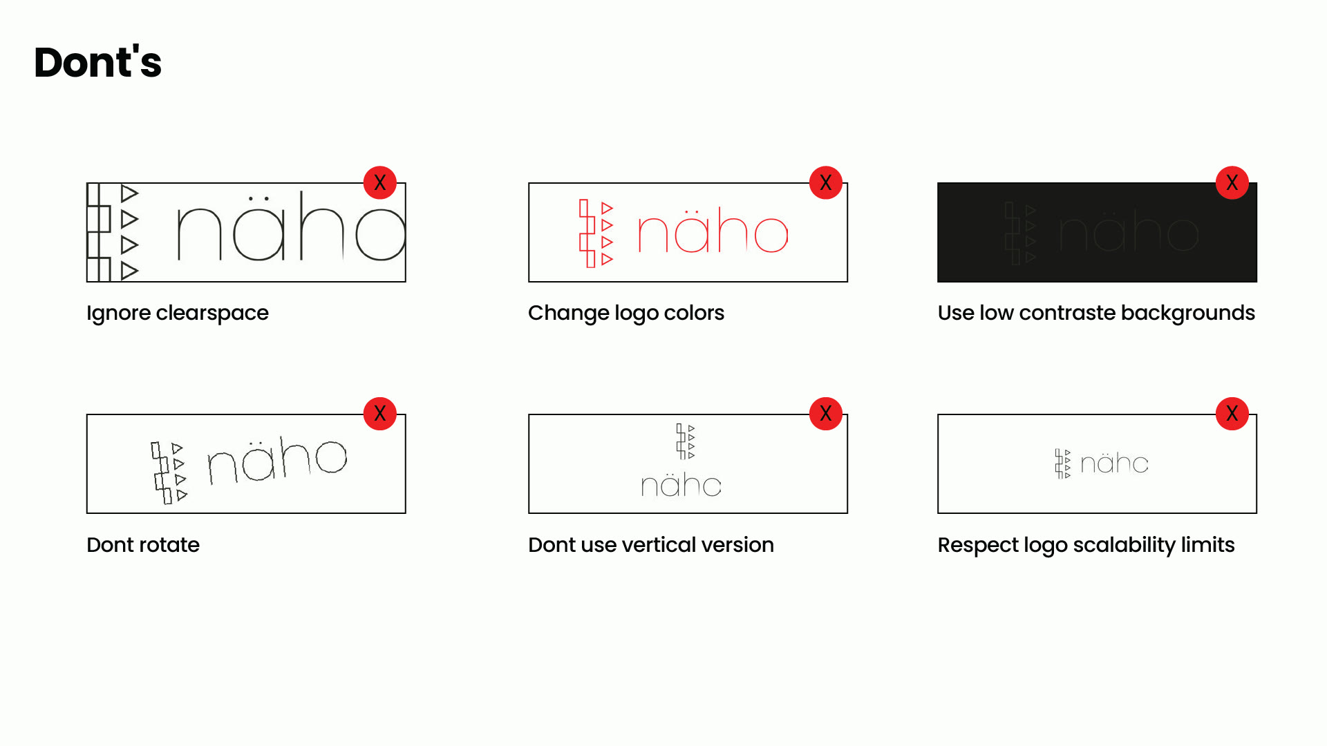
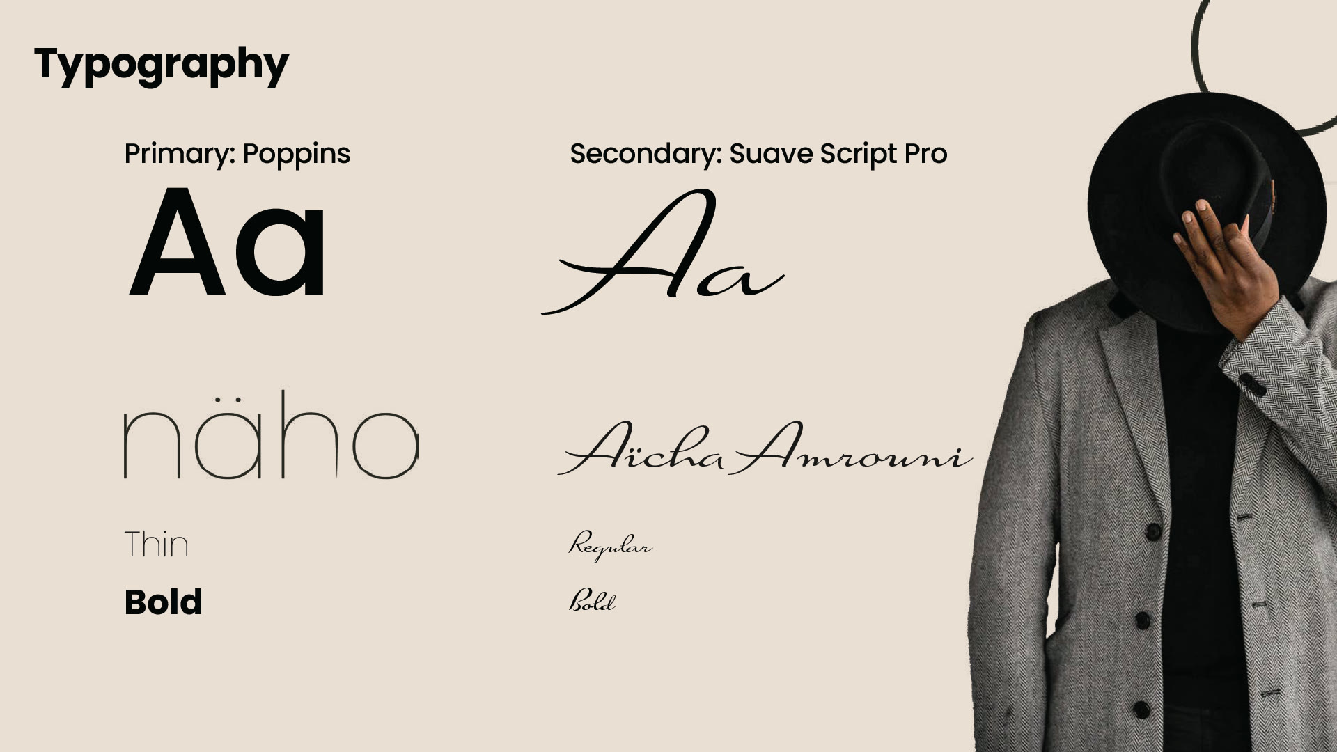
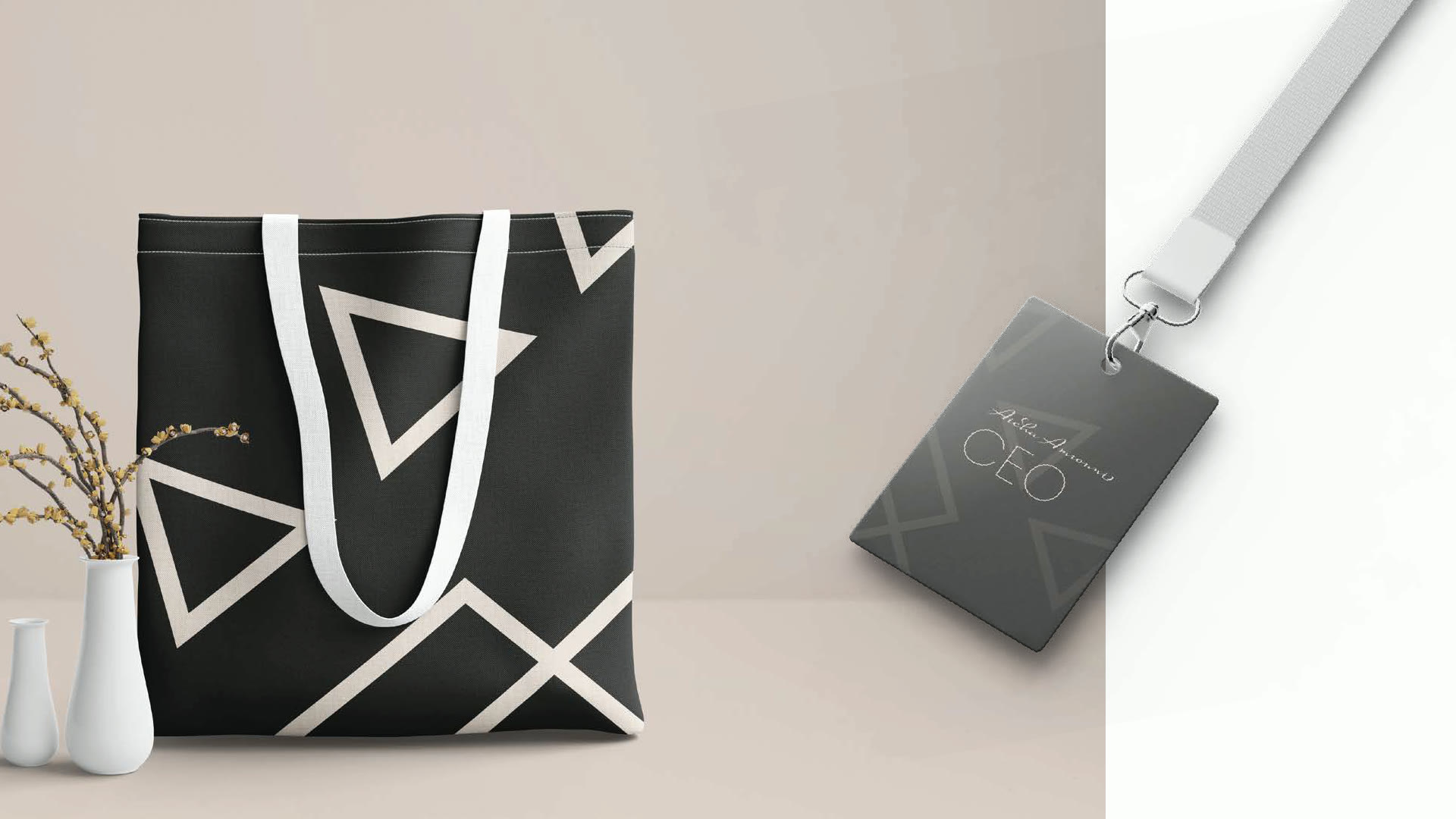
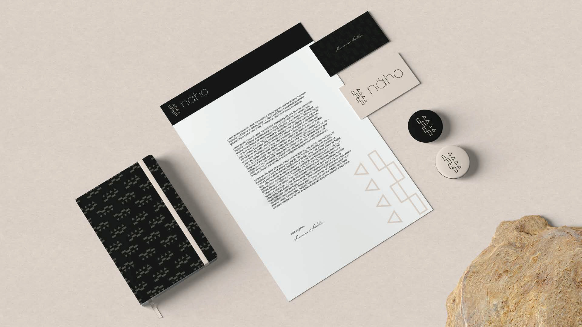
So the work shipped as rules. Clear space measured against the mark itself. The versions that are allowed, and the six that are not, shown as refusals rather than left to taste. Poppins for structure, a script for the signature register, and a pattern derived from the symbol so the brand has something to say across a surface where the logo would be shouting.
Where it has to survive
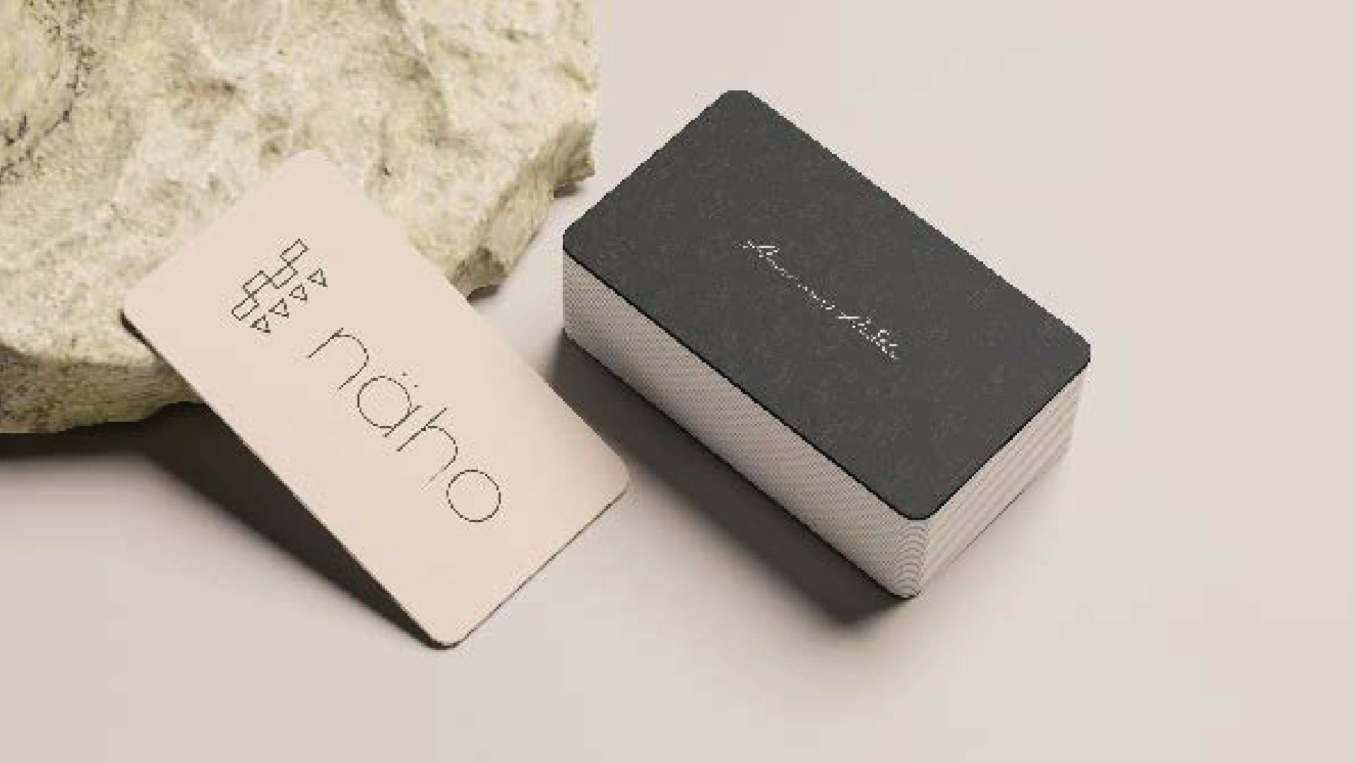
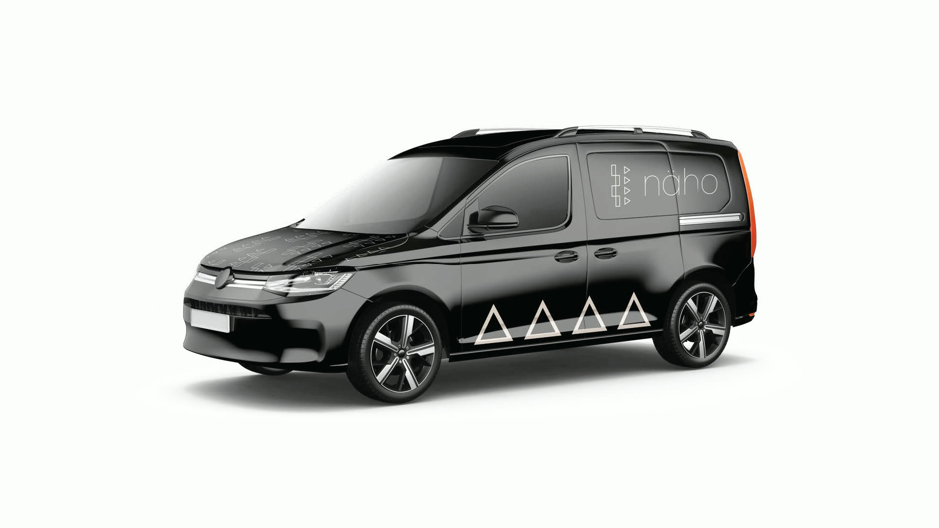
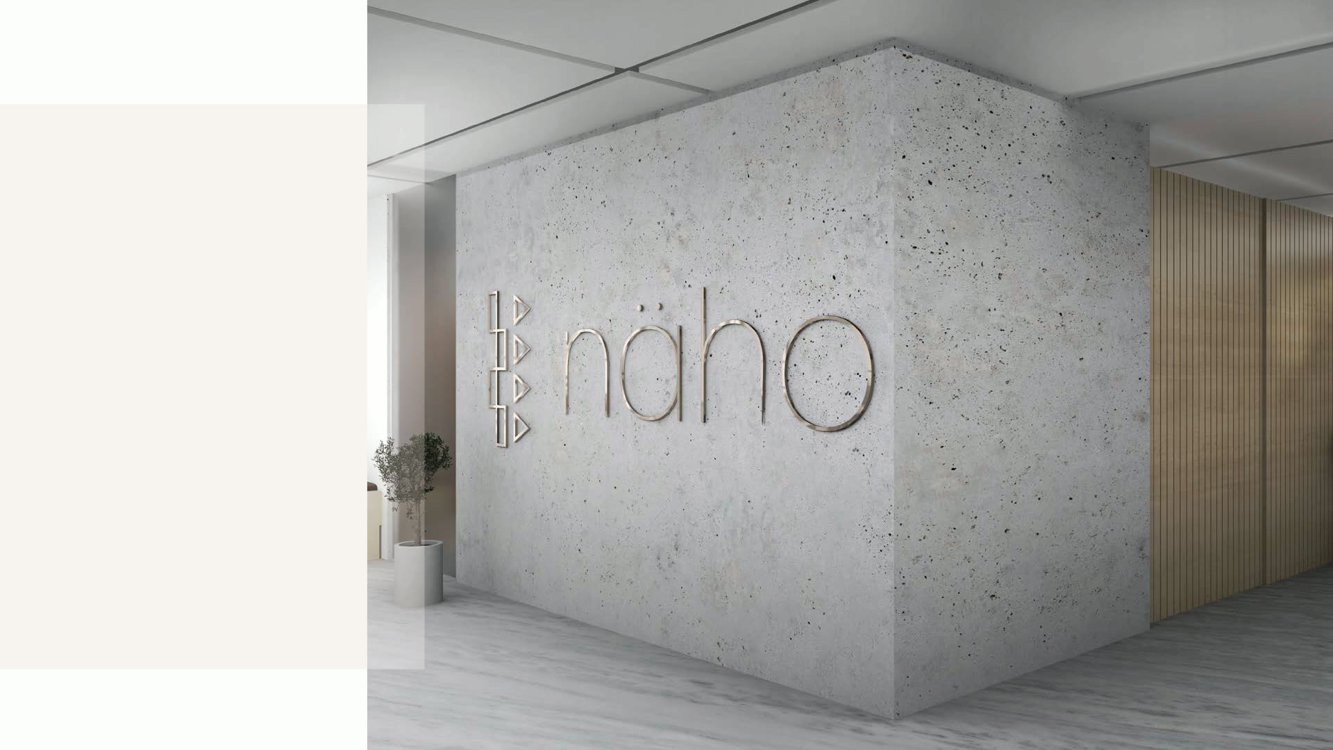
A business card held at arm’s length, a tote read across a room, a van at speed, a mark on a lobby wall in brushed metal. Same identity, four reading distances, and the version that works on one is not the version that works on the next. That is the reason the variations exist.
What I did
Logo design, the identity system around it, and the guidelines document that lets someone else apply both without me.